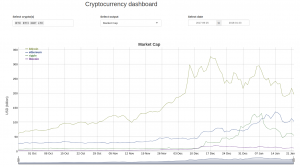
Okay, let’s face it, the whole world has been into cryptocurrencies lately. Bitcoin (BTC), the first cryptocurrency (in fact, the first digital currency to solve the double-spend problem) introduced by Satoshi Nakamoto has become bigger than well-established companies. A lot of crypto followers and investors are looking to keep track of its daily price to better read the market and make moves accordingly. That’s why I have decided to help them out and create a crypto-dashboard.
Next to this, I am developing a tutorial to help an R user build his/her own Crypto Dashboard. The result of the tutorial will look something like my app on shinyapps.
Please let me know if you are interested in this and I will keep you updated!
The dashboard mainly uses a couple of packages: shiny and dygraphs.
Shiny
Shiny is a package for interactive data visualization. It offers input components and a reactive framework to filter your data from those components and display them in a graph. For the crypto dashboard I am using the following components
- Dropdown to select the cryptocurrencies. It is a multiple select, this means that multiple currencies can be chosen at the same time. Each currency will have their own (colored) line in the graph.
- Dropdown to select the output. A user can select from “Price” and “Market Cap”. The output values will be shown on the y-axis in the graph.
- DateRange component: to select the start and end data for the graph.
- DygraphOutput: this is a binding to a plot generated with the Dygraphs package, see below.
Dygraphs
Dygraphs is a fast, flexible open source JavaScript charting library. It allows users to explore and interpret dense data sets. The chart is interactive: you can mouse over to highlight individual values. You can click and drag to zoom. Double-clicking will zoom you back out. Shift-drag will pan. You can change the number and hit enter to adjust the averaging period. Here are the features as described on their website:
- Handles huge data sets: dygraphs plots millions of points without getting bogged down.
- Interactive out of the box: zoom, pan and mouseover are on by default.
- Strong support for error bars / confidence intervals.
- Highly customizable: using options and custom callbacks, you can make dygraphs do almost anything.
- dygraphs is works in all recent browsers. You can even pinch to zoom on mobile/tablet devices!
- There’s an active community developing and supporting dygraphs.

4 thoughts on “Tutorial: Crypto dashboard in R shiny”
I’m interested. Shiny is on my agenda to learn next. Good first project. John from Chiangmai
keep you posted, John!
Interested!!!
please see here https://github.com/ginberg/crypto
Comments are closed.